
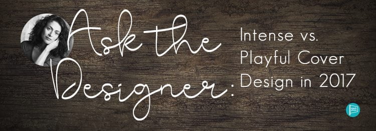
Julie has worked with SparkPress since 2012, and over the course of designing dozens of successful fiction, non-fiction, and YA book covers, we realized something: Authors need to have a better understanding of not only the book design process but the industry-driven perspective that goes into it. Throughout her Ask the Designer column, she shares her perspective on and experience with successful cover design. Here’s what she has to say about playful and fun vs. serious and intense cover design in 2017.
Our novelists work in a variety of genres: everything from literary fiction to more commercial fiction, fantasy to realism, serious to playful. Designing covers for such a variety of books is a challenge—sometimes I am bouncing between several covers-in-progress during a single workday. For this post we’ll take a look at two cover designs I especially enjoyed working on—one an intense novel about loss, and another more playful novel about finding yourself.
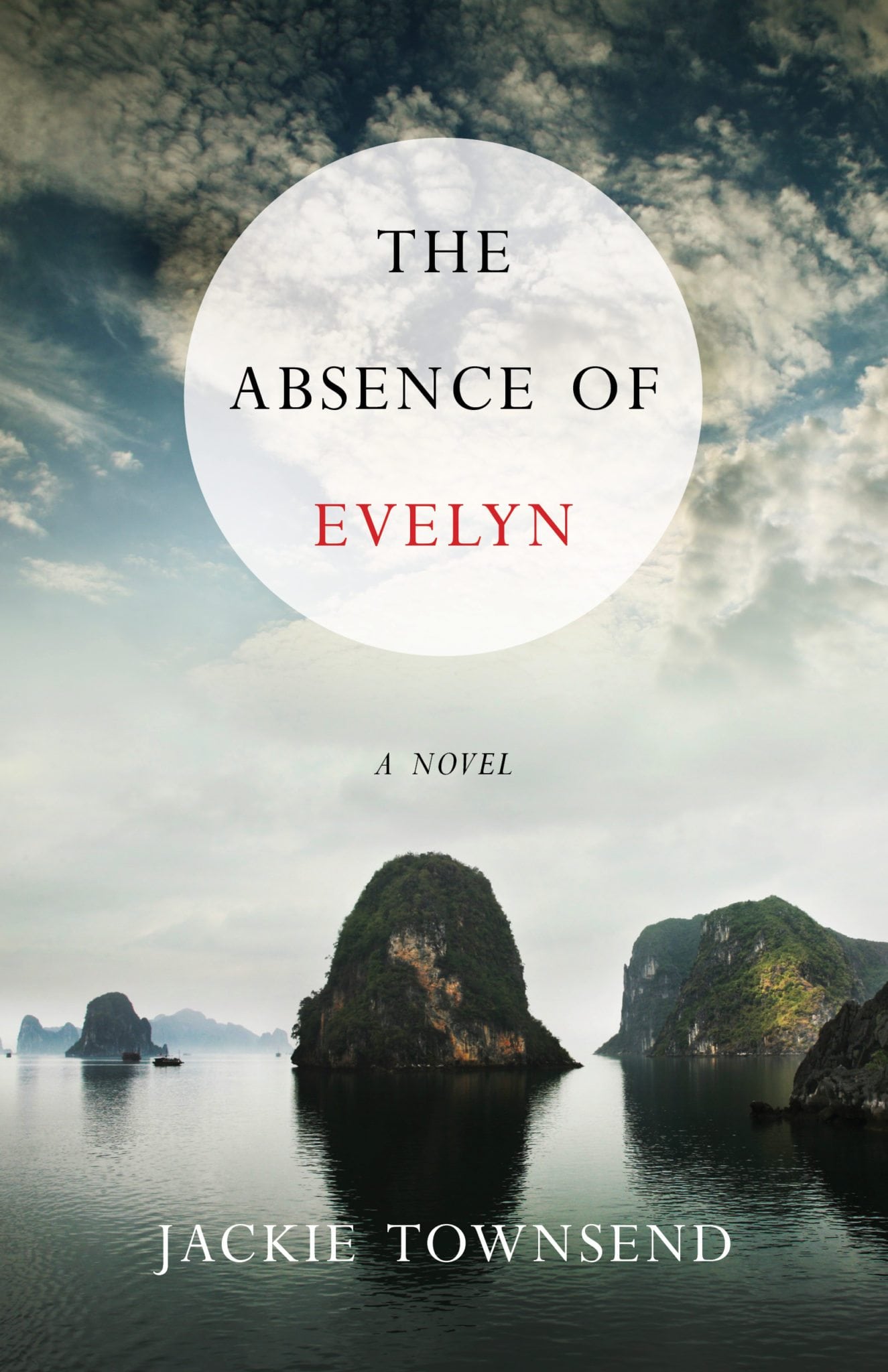
The Absence of Evelyn by Jackie Townsend
 The Absence of Evelyn is about how newly divorced Rhonda, haunted by her sister Evelyn’s ghost, travels to an old palazzo in Rome to confront Marco, the man who stole her sister’s heart—only to find out he’s vanished in the wake of Evelyn’s death. Meanwhile, Rhonda’s nineteen-year-old daughter Olivia, adopted by Rhonda at birth, travels to the mysterious and lush waters of northern Vietnam. That’s where she’s been summoned by the missing Marco—a man she only knows from her parents’ whispers. A man she has never met or seen. Soon, truths are exposed and lives unraveled, and the real journey begins.
Four lives in all, spanning three continents, are now bound together in an unfathomable way. And they tell a powerful story about love in all its incarnations, filial and amorous, healing and destructive.
For the cover design, I took into consideration that The Absence of Evelyn tells the story of several characters who journey psychologically and physically: a woman haunted by the death of her sister Evelyn, a man Evelyn loved, and her adopted daughter.
The daughter travels to Vietnam, and the startlingly beautiful landscape I’d seen in photographs seemed to suggest something of the emotional upheavals in the novel. We read novels for many reasons—and one of the main ones is for vicarious travel adventures. When I saw this particular image  of the Vietnamese coast, I was immediately drawn to the overlaying of rocky outcroppings that take a viewer’s eye into the distance.
The ominous reflections contrast with the texture of the clouds against a blue sky in a way that evokes the complex inner life of the four main characters. And I treated the circular panel for the title type as a kind of translucent window into the landscape. Evelyn is dead at the beginning of the story, but she is the driver of the plot, so I accented her name with
Evelyn is dead at the beginning of the story. But she is the driver of the plot, so I accented her name with bright color. To show her real presence in the novel.
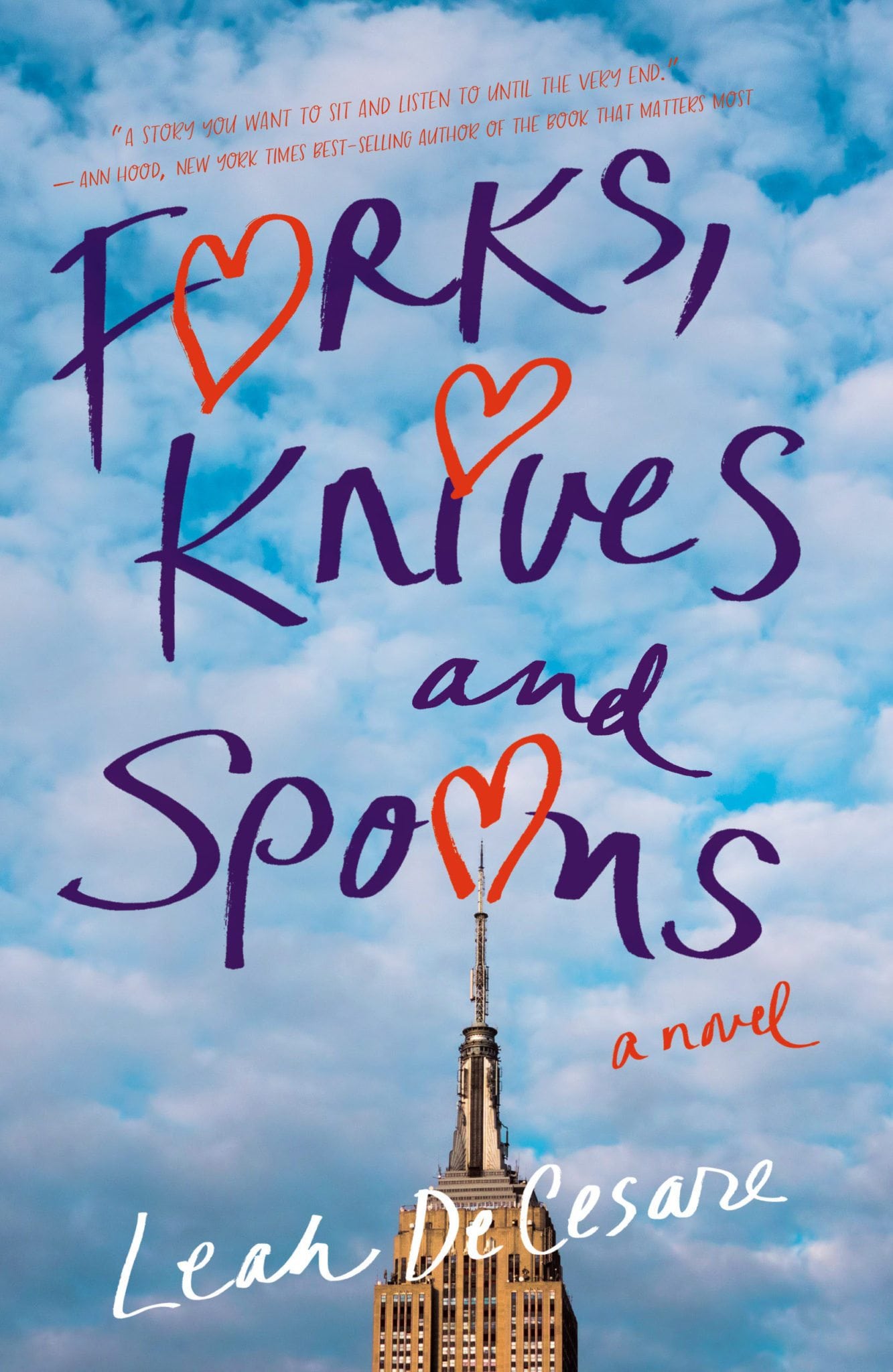
Forks, Knives, and Spoons by Leah Decesare
Forks, Knives, and Spoons is a fun, coming-of-age novel: There are three kinds of guys: forks, knives, and spoons. That is the final lesson that Amy York’s father sends her off to college with. He never suspects just how far his daughter will take it. Clinging to the Utensil Classification System as her guide, Amy tries to convince her skeptical roommate, Veronica Warren, of its usefulness. Together they navigate the heartbreaks and soul mates of college and beyond.
Beginning in 1988, their freshman year at Syracuse University, Amy and Veronica meet an assortment of guys. Slotted spoons and shrimp forks to butter knives and sporks—all while trying to learn if the UCS holds true. On the quest to find their perfect steak knives, they learn to believe in themselves. And not to settle in love or life.
When designing this cover, I thought about how the title Forks, Knives, and Spoons might suggest a cookbook, but it actually refers to some fatherly advice given to the main character Amy York as she sets out for college. “Men can be classified like utensils,” he says, “they are like forks, knives and spoons, so choose wisely…it’s the sturdy straight knives you want, rather than the slotted spoons and wimpy shrimp forks.”
A rule of cover design—with few exceptions—is not to go “on the nose” with imagery. Duplicating the object or person your title references doesn’t offer your reader new information or add depth to your cover. In this case, some real confusion might result if utensils were chosen for the cover. The challenge here was to add some lightheartedness. And clue the reader that this is a story about young womanhood, friendship, and the search for love and self-confidence.
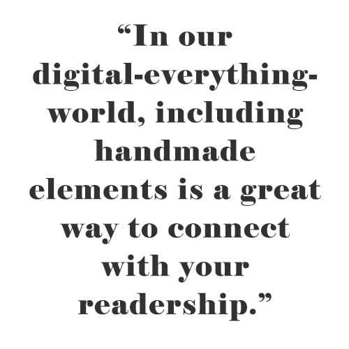 Since the heroine has a view of the Empire State Building from her apartment window, I went searching for an image of this iconic skyscraper to provide a playful backdrop for the title. I knew right away that I wanted to hand letter the title, giving the type a feeling of intimacy. In fact, as you will see at your local bookstore, hand lettering is having a huge moment now. In our digital-everything-world, including handmade elements is a great way to connect with your readership, and is a liberating step away from computer-generated typefaces.
Hand lettering is always an adventure, but with experimentation and trial and error, all the elements can come together. In the end, the loose script gives this cover a unique look, with lots of color and energy.
Leave A Comment