
Julie Metz has worked with SparkPress since 2012, and over the course of designing dozens of successful fiction, non-fiction, and YA book covers, we realized something: Authors need to have a better understanding of not only the book design process but the industry-driven perspective that goes into it. Throughout her Ask the Designer column, she shares her perspective on and experience with successful cover design. Here’s what she has to say about playful and fun vs. serious and intense cover design in 2017.
This season I worked on several novels encompassing a wide variety of themes and characters with one thing in common—a bit of mystery, and darkness, some hope, but no easy answers.
So what did my cover designs have in common? A color palette that explores every shade of blue.
Blue can express sorrow and loss, but it can also communicate hope, clarity, and even joy. With the exception of the sky that encircles us, blue is a rare color in nature, and therefore prized. Perhaps that’s why it never fails to capture our visual attention, in whatever hue it appears.
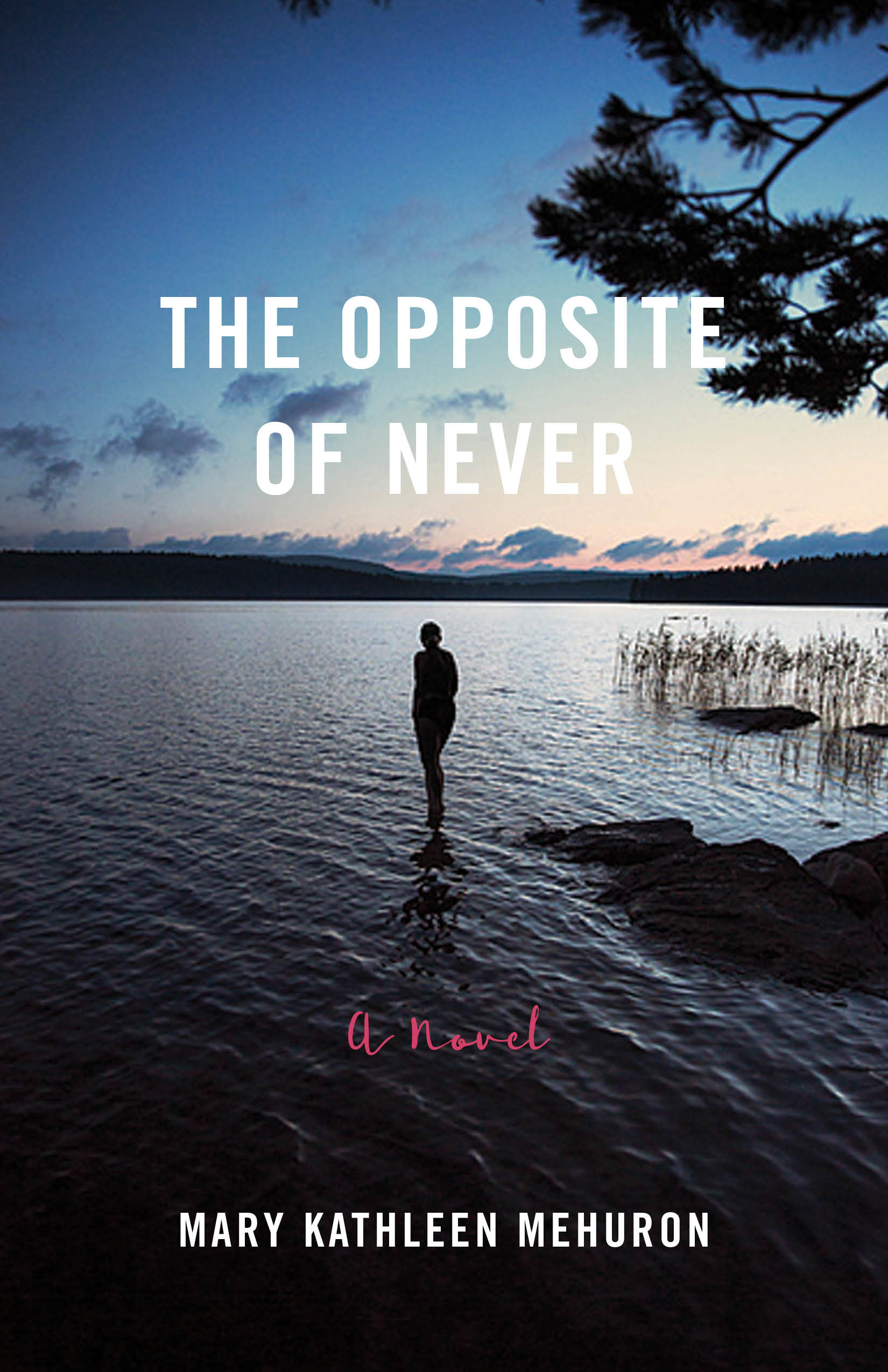 The Opposite of Never tells the story of a widowed man and woman who meet through friends and begin to overcome their losses together. The children of this friend circle are not so lucky, and head into drug use that threatens to overwhelm the two families and budding romance. For the cover of this novel, I wanted to set the scene in Vermont, a woman alone, an open lake that suggests her loneliness—but also the possibilities that await. A rich indigo sky and reflective water cast a bittersweet mood over the image, with a distant note of warm peach tones at the horizon, drawing our eye into the expansive landscape. The result is meditative and thoughtful, with the quiet drama of the silhouetted female figure.
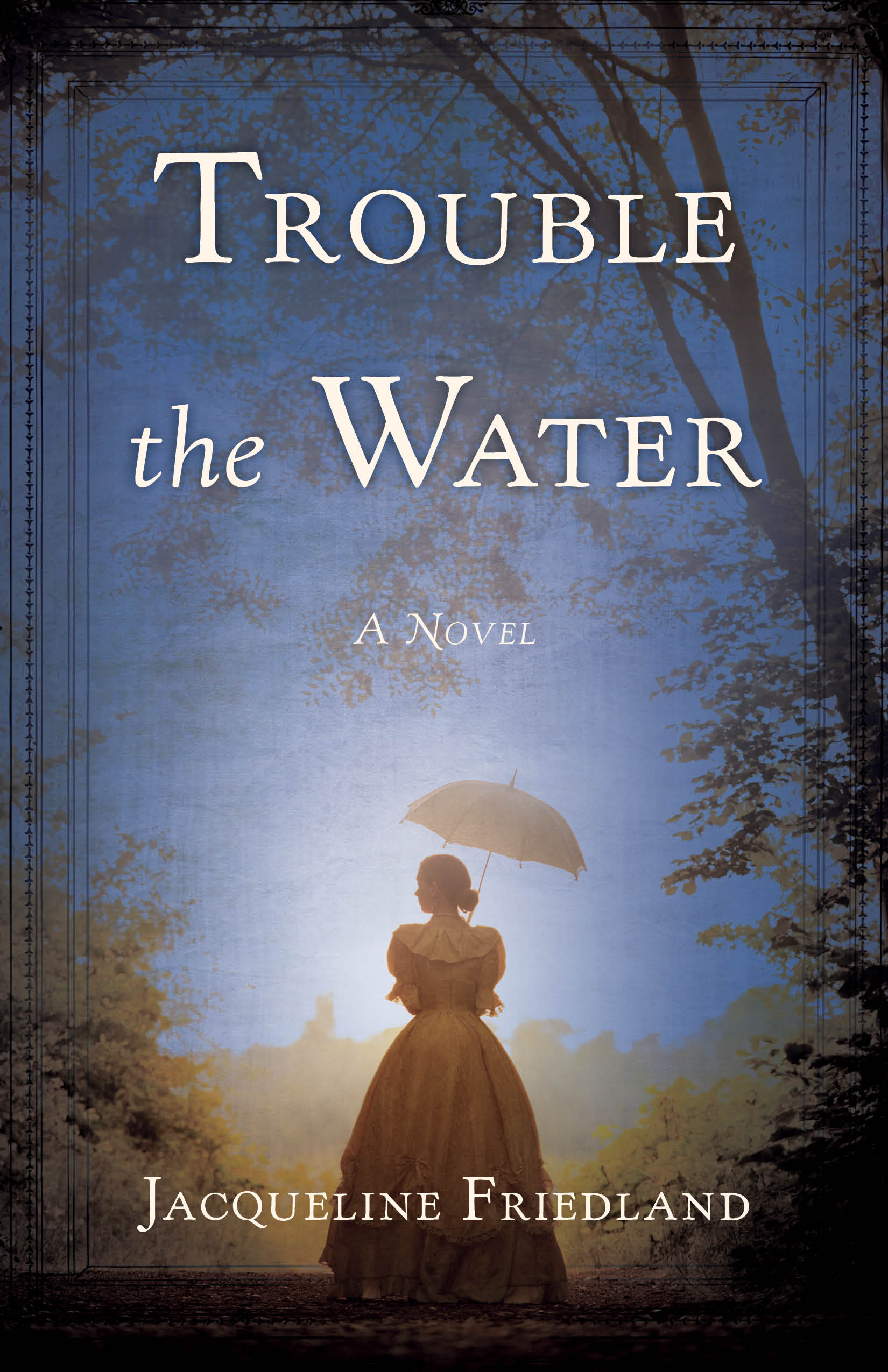 The dark time of American slavery is the setting for the historical novel Trouble the Water. Abigail Milton, a young Englishwoman from a financially strapped family, is sent to live with a family friend in Charleston, South Carolina. Gradually, Abigail discovers that her benefactor is involved in the secret abolitionist movement. I found a beautiful photograph of a woman in period dress, but it was missing an element that would evoke both the water and trouble of the title. A color wash of slate blue gave the image a completely different mood. A spot of clear light on the heroine focuses our eye, so that we know we will be seeing this story through Abigail’s eyes.
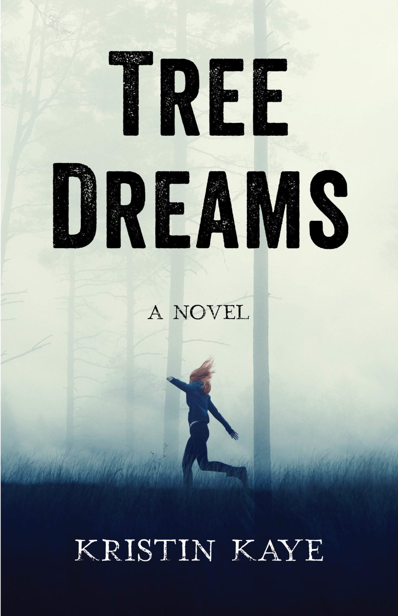 Tree Dreams is a crossover novel about a young girl who flees California for the Oregon forest, living high in the canopy of a redwood grove with a band of environmentalists, radical slackers, and anarchists. The author had a clear vision for her cover, of a young red-headed girl running through a forest. She also hoped we would use typography that evoked old-style letterpress printing. I was thrilled to find this photo, which we edited only slightly to emphasize the girl’s red hair. The title evokes mystery, while the beautiful soft blue toning of the trees, mist, and grasses in the foreground reveal a world we want to find out more about.
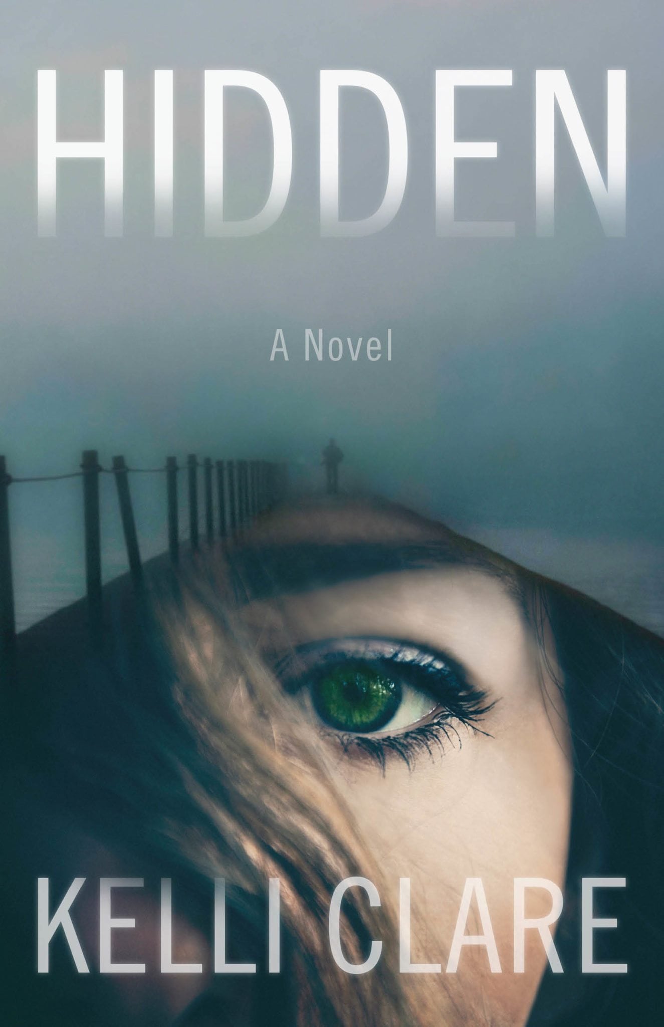 For the cover of the mystery novel Hidden, we wanted to capture the main character, a woman with remarkable green eyes, and the menacing male figure who plays a role in the story. I combined a misty image of a lone man at the end of a long dock, with a close-up shot of a woman whose face is mostly obscured by strands of hair. Her green eye meets and rivets our gaze. Our expert Photoshop artist, Windy Veil, re-toned these photo-composited images, adding a wash of ocean blue to the sky, her hair—even subtly tinting her eyelashes and the rims of her green eye. We can feel a cold blast of English sea and wind, and the danger that the character will face.
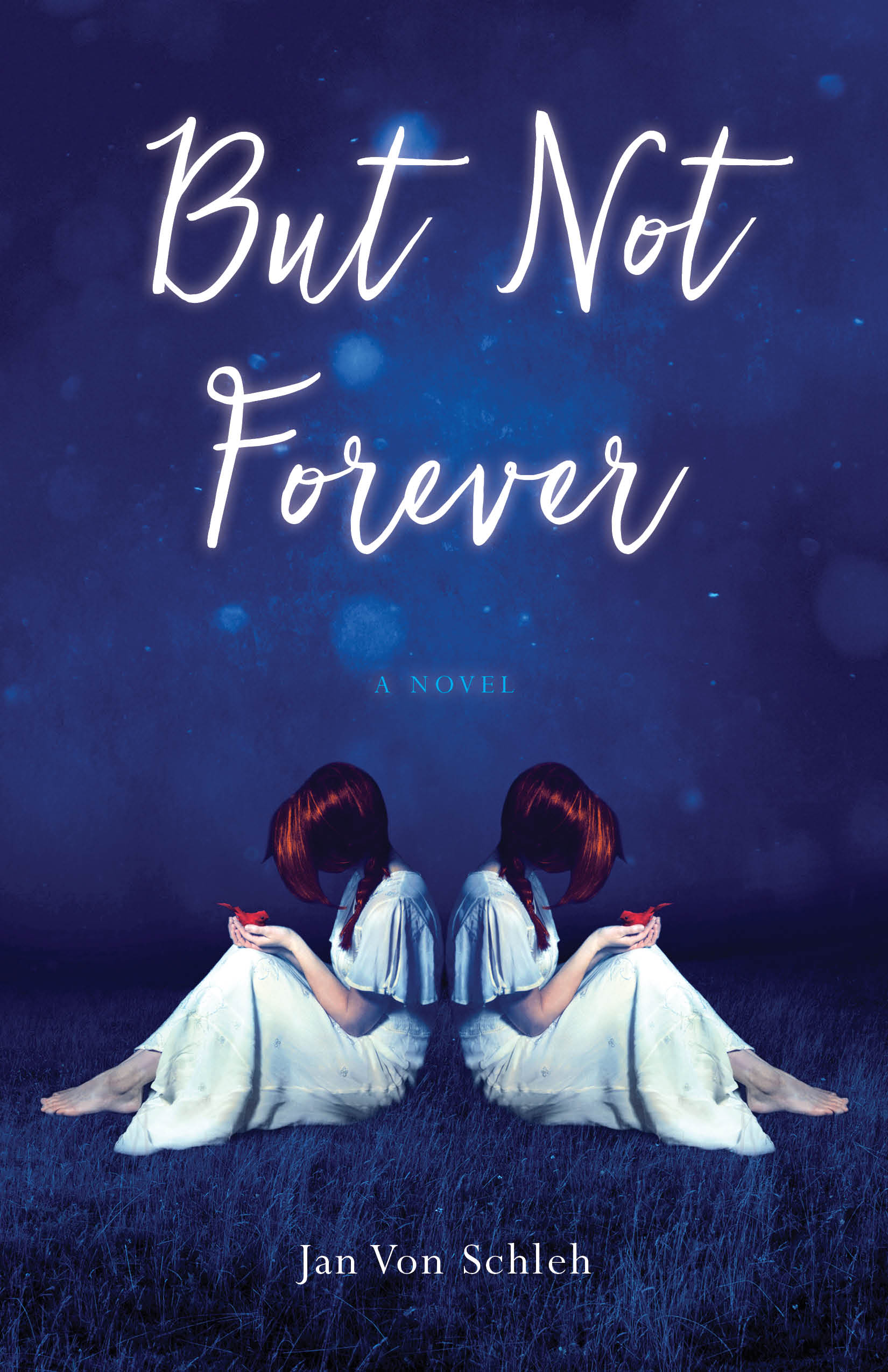 But Not Forever is a time-travel novel where two young women trade places, represented by the anonymous women on the cover. If time travel has a color, it is definitely blue; we needed just the right tone that would really pop and create a world the reader wants to enter. We worked through several iterations of this design until we reached the right color—a rich ultramarine with lighter flares of sparkling stardust. The contrast in the image was heightened to include pops of red in the girls’ hair and the bright red bird in their hands, and added a foreground of deep blue grasses that recedes into the background. The effect is as if the image has been colored with the dye of the mysterious indigo plant, a pigment that transforms when oxidized.
I’m thrilled with how these covers turned out and I hope the designs will help readers connect with the mysteries worlds of the stories inside—and I should have mentioned right at the beginning of this post that blue happens to be my favorite color!
Leave A Comment