
Julie has worked with SparkPress since 2012. Over the course of designing dozens of successful fiction, non-fiction, and YA book covers, we realized something. Authors need to have a better understanding of not only the book design process, but the industry-driven perspective that goes into it. Throughout her Ask the Designer column, she shares her perspective on and experience with successful cover design. Here’s what she has to say about her love affair with finding visuals for fictional worlds, and balancing the literal translations of the storyline with more nuanced portrayals.
I work on many novels where the author has created a fictional world I will never experience in my own life. Thankfully the process of designing a cover that accurately conveys these imagined worlds allows me to travel along with the author. The challenge is to make the world visible to the reader in just a glance and along the way as a designer, I do find myself getting quite attached to the topics and images that I feel really capture the story.
Here are a few recent designs where I fell just a bit in love with how the designs evolved through the collaborative process of working with our publisher and our authors to find visuals of fictional worlds. It’s important to keep in mind that this collaborative process is unique to our model, and in traditional publishing, the author usually has little to no involvement in cover art.
Satisfaction is a story about two women who go on a self-healing road trip as fans of The Rolling Stones. I hope I’m not dating myself too much by saying that as a teenager growing up in New York City I was a Rolling Stones superfan. I played their albums obsessively (to my parents’ chagrin), and knew all the songs by heart. While the young feminist in me chafed at Mick Jagger’s in-your-face macho bravado, I secretly loved the band’s bad-boy reputation. And there’s no Stones song more instantly recognizable than the urgent, genius guitar riff of “Satisfaction.” Then Mick launches into his breathless When I’m driving in my car, and a man comes on the radio…rant that has to be one of the most savage and still-true critiques of our buy-this-buy-that culture. But for all my fandom, I’ve only seen them live once, at Madison Square Garden (I’m not going to tell you the year). For me, The Stones http://www.honeytraveler.com/buy-symbicort/ sound best in a car, loud, on the road to anywhere. 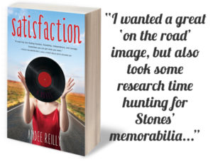
So, the premise of this novel immediately drew me in. While designing this cover, I wanted a great “on the road” image to match the storyline—not only of the two girls’ road trip, but the proverbial “trip” they each must embark on, mentally and emotionally, which connects this music and the choices they must make to move forward in life. I also took some research time online hunting for Stones memorabilia, even buying myself an old concert ticket (Dallas Cotton Bowl, 1981!) and a 45 rpm single of the title song—that clearly fed into the cover you see here.
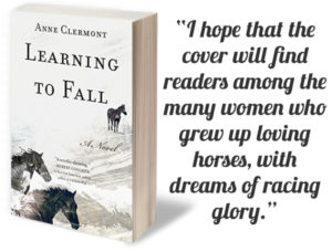 Learning to Fall describes a world of horse racing I know little about. However, through summers at camp and friendships with riding enthusiasts, I have come to appreciate the mysterious magic of their connection with humans. For this design we looked at many photographs of racehorses, but settled eventually on a piece of art that especially spoke more to our author than any of the photographs we looked at. It’s reminiscent of some of the illustrated books I loved as a child, and I hope that the cover will find readers among the many women who grew up loving horses, with dreams of racing glory.
I’ve had so much fun working on the covers for the Wendy Darling series, Colleen Oakes’ YA re-envisioning of Peter Pan’s heroine. We established a format and blue-toned color palette in Stars, the first book of the s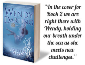 eries. I especially fell in love with our illustrator Monica Gurevich’s whimsical ornament of stars and waves.
For Book 2, Seas, we wanted to carry these ideas forward so that the series would form a beautiful and inviting trio for readers. We considered many images until we found this one, which perfectly captures the sense of adventure this series is all about. In the first book, Wendy is flying out a window, beginning her journey to Neverland. In this cover for Book 2 we are right there with Wendy, holding our breath under the sea as she meets new challenges. I am more than a little in love with these covers and super grateful to all our collaborating photographers who’ve brought so much to this series. All I can say is—just wait till you see the cover for Book 3!
Leave A Comment