
This is the second installment of our Ask the Designer blog by renowned book cover/graphic designer Julie Metz. You can read more about Julie and why we at SparkPress think that this blog is so relevant in Julie’s first post, Julie Metz on the 7 Successful Elements of a Book Cover. But as a recap, Metz has more than 25 years in the graphic design and publishing industry, worked with everyone from Random House to HarperCollins, and one of her designs became the cover for The Poisonwood Bible by Barbara Kingsolver, which was selected for Oprah’s Book Club and a finalist for the Pulitzer.
She’s worked with SparkPress since 2012, and over the course of designing dozens of successful fiction, non-fiction and YA book covers, we realized something: Authors need to have a better understanding of not only the book design process, but the industry-driven perspective that goes into it.
Read on below to discover the surprising last-minute additions and “happy accidents” that made three backlist—and one upcoming—SparkPress covers really stand out.
In my first post I talked about how the best ideas often come into play by accident—a late arrival to the creative party (it’s helpful to maintain an attitude of play when designing!) Happy accidents are what we live for.
I’d like to look at a spring 2016 SparkPress title as well as three titles from our backlist where this happened. The result? We ended up with the right mix for the final design.
Backlist first. We’ll look at The Year of Necessary Lies, The Balance Project, and Beautiful Girl. The upcoming spring 2016 title for this post is The House of Bradbury, pubbing May 10.
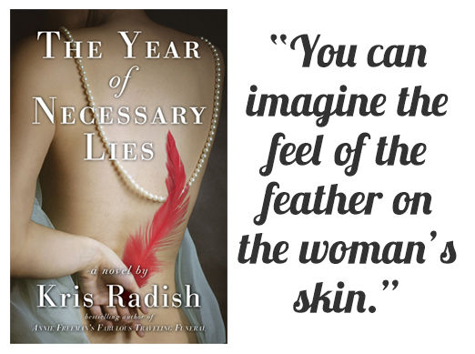
The Year of Necessary Lies is a historical novel about a woman who comes into her own power as she takes up the cause of bird extinction caused by the insatiable desire for exotic feathers for women’s hats. At the turn of the 20th century, upper-class women wouldn’t have left the house without a hat—and a very flamboyant one at that. The story juxtaposes Julia living in 1903 with her great-granddaughter Kelly, who uncovers the story of Julia’s momentous year. We wanted some gorgeous sexiness for this cover that suggested the historical setting, but could also represent the present-time heroine as well. We found a beautiful portrait of a woman’s back, elegantly draped with a pearl necklace and a sumptuous blue cloth, her hand behind her as if she is hiding a secret. I loved the image, but there was something missing—the bird element. And the woman’s hand seemed to be begging for something to hold. Further down the road, we decided to place a feather in her hand, which had the added benefit of adding a pop of bright color. Monica Gurevich did the beautiful photo assembly and the result is definitely more than the sum of its parts. The image really tells a story with its tactile sensuality. You can imagine the feel of the feather on the woman’s skin.
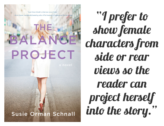
The Balance Project is a contemporary novel about a woman in New York City who, as the title suggests, is struggling to find the balance between her work and home life. I think I can safely say that I looked at a hundred or more images of women, trying to find the right one. I felt like I was the casting agent for a movie. When we found this shot of a woman on a city street, viewed from behind, it just felt right. I prefer to show female characters from side or rear views so the reader can project herself into the story. Windy Waite, our talented artist, did some tweaking to the photo to enhance the colors and lighting, and “tailored” her dress to give it a more contemporary style and fit. Ah, the wonders of Photoshop. The final cover allows readers to imagine themselves in this complicated situation that so many working mothers face.
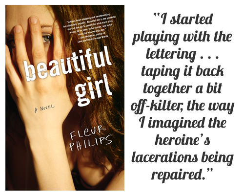
Beautiful Girl is a YA novel about 17-year-old Melanie, whose beauty has set her up for a career as a model and actress. She is the daughter of an obsessed stage mother who drags her to auditions—but Melanie wants a different life. When Melanie is involved in a car accident that disfigures her face, she sees an opportunity to escape and live a “normal” life. I wanted to find a photo that showed a girl hiding her face from the viewer. This one stood out immediately. I loved the intense gaze of her beautiful gray green eye. She’s looking at us intently but we cannot see her face. I also wanted to suggest the idea of her disfigurement without having to show it. In the end it felt natural to let the typography do this work. I started playing with the lettering, distressing it by hand, cutting it up with a scissors, taping it back together a bit off-kilter, the way I imagined the heroine’s lacerations being repaired. There would always be scars. Melanie would carry those scars with her into her adulthood, but they would give her a new kind of power. I thought back to a beautiful girl I knew in high school, who had a distinctive facial scar, one that made her face even more arresting than if her face had been “perfect.” I added the hand-lettered author’s name as if it were Melanie writing her name on a school notebook.
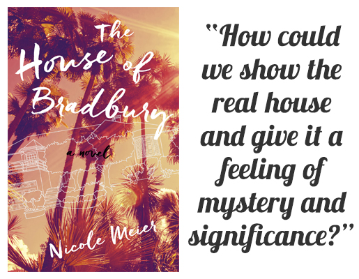
Now, onto our current May release, The House of Bradbury, which had a similar story with last-minute touches as these back titles. This novel has an ingenious plot: A woman buys the house that was once home to the legendary sci-fi writer Ray Bradbury. I wanted to show the movie-town glamour of Los Angeles, so this shot of palms and blasting sun stood out right away. When I looked up Ray Bradbury’s house on a real estate site, I saw that it wasn’t especially glamorous at all, just a modest (for Hollywood!) yellow house in Cheviot Hills surrounded by suburban-looking shrubbery. I thought about finding a photographer to take photos of the actual house that might be more atmospheric, but by the time I began working on the cover, the actual property had been sold—to be replaced with an “architectural statement” house by a famous architect! Alas, nothing is sacred these days! Our problem remained: how could we show the real house and give it a feeling of mystery and significance? I decided to try representing the house as line art, like an architectural diagram—“real,” and also a bit of an illusion. Windy Waite created the line art here from a photo of the real house, just to be sure that Ray Bradbury fans who come to the novel will feel that we got it right.
In my next post we’ll check out three more backlist titles and a new novel called Tracing the Bones. We invite you to send in your comments and questions!
Leave A Comment