
This is the second installment of our Ask the Designer blog by renowned book cover/graphic designer Julie Metz. You can read more about Julie and why we at SparkPress think that this blog is so relevant in Julie’s first post, Julie Metz on the 7 Successful Elements of a Book Cover, and again in her second installment, Last Minute Touches That Made 4 Book Covers Stand Out. But as a recap, Metz has more than 25 years in the graphic design and publishing industry, worked with everyone from Random House to HarperCollins, and one of her designs became the cover for The Poisonwood Bible by Barbara Kingsolver, which was selected for Oprah’s Book Club and a finalist for the Pulitzer.
She’s worked with SparkPress since 2012, and over the course of designing dozens of successful fiction, non-fiction and YA book covers, we realized something: Authors need to have a better understanding of not only the book design process, but the industry-driven perspective that goes into it.
Below, Julie uses 3 SparkPress covers as examples to show how you can channel that particularly edgy theme and complex storyline that you’re trying to get across…
Have you written a literary novel that deals with unusually edgy subject matter? It’s an author’s challenge to come up with the story and themes and write a complex story; it’s our job as designers to find a way to present this material to potential readers in a way that will engage viewers and invite them to buy your book. In this post we’ll take a look at two backlist titles and one current novel where the offbeat, sometimes dark content led the way to successful covers. The trick is to find the light in that darkness.
The first thing to remember in designing covers for literary novels, and for that matter any other book of fiction, is that no matter how complex the story and themes the cover can’t and shouldn’t tell the whole story. What the cover needs to do—especially now when buyers are often looking at a postage stamp sized image on a website—is to communicate the essence of the emotional world the book’s characters live in, an authentic and unique sense of place and personality. We can do this with images that will resonate—of a single character or characters, an evocative setting, an object. Sometimes we can suggest this without any image by making startling use of color and typography. Sometimes we will use aspects of all these elements. I spend a lot of my designing time searching for images. Even when I have some fantasy image in my mind, I try to push that aside to make room for something I never expected to find which might be a million times more exciting and fresh. As I’ve mentioned in previous posts, the best results come together in some combination of kismet and effort.
Bear Witness by Melissa Clark
Bear Witness is a YA novel that deals with a rough subject. A young woman named Paige, who as a child witnessed the abduction of her best friend, is trying to make her way into adulthood. In considering the cover, I tried to imagine what it would be like to be this young woman who lives with such terrifying memories. As a mother I know that it’s tough enough to be an adolescent without the burden of such a traumatic event.
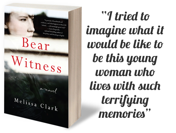 I imagined that Paige might live with a fear that she can never feel perfectly safe. I came across this image of a young woman peering through the blinds of a window. There was something about her intense expression and the texture of grit and blur on the glass that felt right, suggesting her dark past but also a hopeful glimpse into a different kind of future. We opted for a restrained type treatment and just a pop of color to highlight the title.
Ways of Leaving, by Grant Jarrett
Ways of Leaving is a terrific novel by Grant Jarrett. His main character is a man living through rough times who decides to return to his rural Pennsylvania hometown. Misadventures with family and love interests ensue, but throughout these pages there is just the right touch of absurdity and humor. The last pages were truly inspiring and I won’t spoil those for you by telling you any more here! I knew I wanted to find an image that would capture the dark hilarity of Jarrett’s narrative voice.
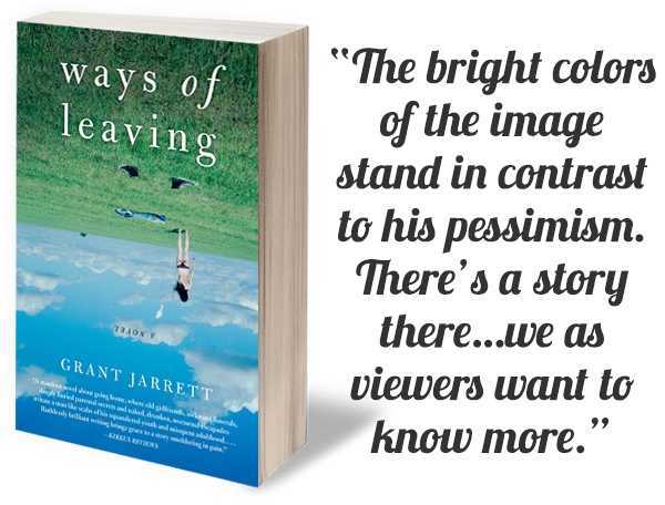
We considered a number of images but we settled on this one of a woman in a field semi-nude, her clothing strewn about. It seemed to capture some of the narrator’s fantasy life and his own pathetic situation as well. The bright colors of the image stand in contrast to his pessimism. There’s a story there…we as viewers want to know more. And for those of you who love a good short story, Grant has a new anthology out this month called The House That Made Me… for which I wrote an essay.
Tracing the Bones, by Elise Miller
Tracing the Bones is a seriously quirky novel, a suburban satire with a dark edge, following the story of Eve a woman whose marriage unravels with surprising results. I designed Elise Miller’s previous novel
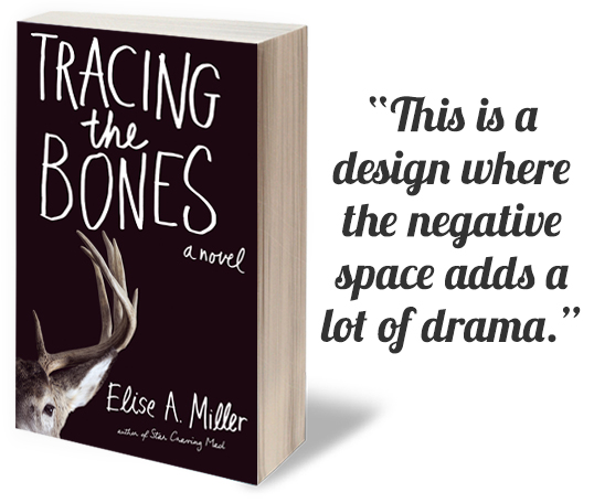 I loved the idea of incorporating my own handlettering as part of the cover, in a style that suggests the humor, against a black background. This is a design where the negative space adds a lot of drama. The deer staring out at us suggests a scene in the book…but I won’t spoil the fun for you here!
Leave A Comment