
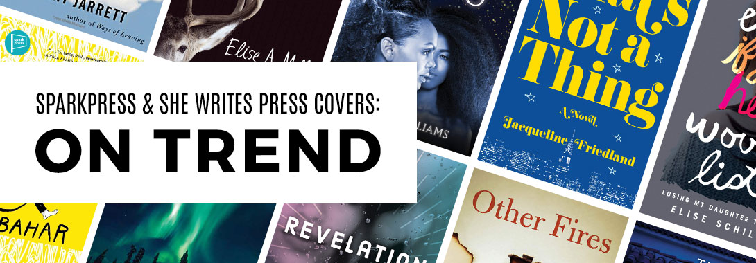
Last year, we were delighted to discover that a 99designs article highlighted book cover trend predictions for 2019—trends that SparkPress, had been implementing ahead of the curve. Thus, we kept an eye out for 99designs’ cover design predictions for 2020! They highlighted seven, and between She Writes Press and SparkPress, we’ve got them all covered.
Distinctive typeface
In 2020, we should expect to see a lot of distinctive fonts gracing book covers. These are fonts that will be unique to the author or series. Some are hand-lettered (but that’s a whole other trend) and some are new font families created by designers.
We’ve had distinctive typefaces since 2015, starting with Alane Adam’s picture books.


More recently, in 2019, Echoes of War by Cheryl Campbell had a beautiful, distinct font that absolutely oozes sci-fi. Coming up in May, we have The Goddess Twins by Yodassa Williams with a font that feels delicate and magical. It almost seems to glow!


Delicately illustrated book covers
As we enter this new decade, we may start to see a shift from bold illustrations to more delicate ones, like light illustrations and line art.
SparkPress first used this style in 2017, with an illustration on the cover of Potty-Mothed by Anne Johnsos.

It was quickly followed by the 8th Island trilogy by Alexis Marie Chute, the final installment of which is out this April.


Another recent line drawing cover we’ve had was Roots and Wings by Margery Kraus with Phyllis Piano.

Rainbows and primary colors
While the article concedes that covers mainly in black and white will always have their place, in the past, designers have shied away from the boldness of primary colors. Now, they’re embracing the whole rainbow—especially the primary colors. We discussed yellow covers last year as a 2019 trend, so we won’t repeat those. However, we love a blue cover. Not just teal, as was trendy around 2014, but a true primary blue.
We started seeing blue covers on SparkPress back in 2015 with the first two installments of the Wendy Darling series by Colleen Oakes.


This was quickly followed by The Goodbye Year by Kaira Rouda and The Half-Life of Remorse by Grant Jarrett.


Coming in 2020, this trend will continue with That’s Not a Thing by Jacqueline Friedland in April—and bonus, the typography is yellow, another primary color. Then in October, we’ll see it pop up again on Alison Levy’s first installment in the Daemon Collecting series, Gatekeeper.


Textured covers
While these covers may not actually be textured, they certainly look it. They pop out at you as having depth in a way that traditional covers don’t. This goes beyond the trend of the titles interacting with the image that we saw as a trend in 2019, though it does incorporate it.
This is a trend that at SparkPress, we’ve only seen on Squirrels in the Wall by Henry Hitz thus far.

However, on our sister imprint, She Writes Press, which uses the same cover design team, we’ve been seeing this since 2016 with There Was A Fire Here by Risa Nye. We should expect to see it again this October with Other Fires by Lenore H. Gay.


Creative photography
This innovative trend uses photography in unique ways—often obscuring the face of the subject or creating the subject in the negative space. It’s the new trend for fiction, which traditionally avoids photography outside of stock photos.
While this trend has yet to be utilized on a SparkPress cover, we’ve seen this on She Writes Press as early as 2013 with Watchdogs by Patricia Watts.

More recently, we’ve seen creative photography on the cover of Revelation by Bobi Gentry Goodwin.

Found materials
This trend is almost an elevated collage—the designers repurpose materials found in the world around us to create a book cover.
On She Writes Press, we’ve seen elements of it incorporated on the cover of Screwnomics by Rickey Gard Diamond.

Coming up this August, we have the peeling tape on Poetic License by Gretchen Cherington. We look forward to seeing this trend on the covers our designers create in 2020 for 2021.

Handwritten pencil fonts
This trend is pretty self-explanatory. Handwritten fonts have been all the rage for years—but gone are the days of calligraphy. Now, the trend is lighter, more relatable handwritten fonts.
We started seeing this on SparkPress back in 2016 with Tracing the Bones by Elise A Miller. Since then, we’ve seen it on The Frontman by Ron Bahar.


More recently, we’ve seen it on Even if Your Heart Would Listen by Elise Schiller.

Leave A Comment