
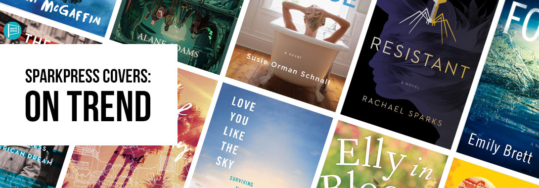
According to an article on 99designs, there are nine major trends we should expect to see on book covers in 2019. At SparkPress, we pride ourselves on our fantastic covers, and we’ve been told in the industry that we’re ahead of the curve when it comes to trends. So here are the biggest trends of 2019 on SparkPress covers throughout the ages.
Big Book Design
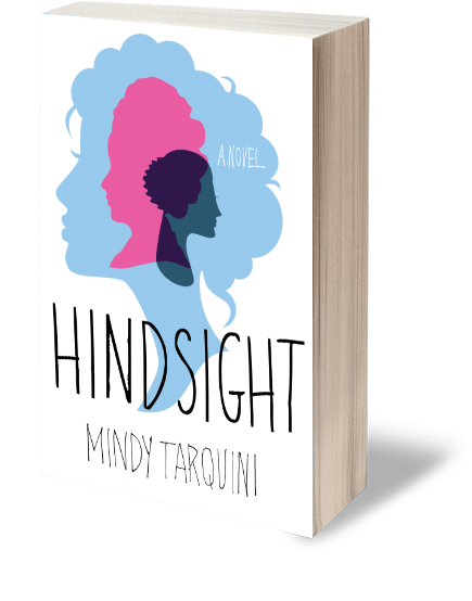
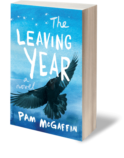
This trend is defined by bold colors, a prominent author name, and a large title. This is something that has been done for quite some time with books by well-known authors, but only recently has it become trendy to do the same for first time novelists.
We’ve been doing this for years. Mindy Tarquini’s debut novel, Hindsight, had all three of these markers. More recently, we did the same for Pam McGaffin’s debut, The Leaving Year.
Sans Serif Fonts
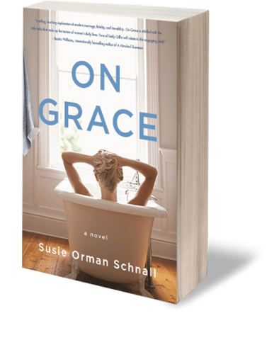
In 2018, the font League Gothic—and its close derivatives—took center stage on “big books.” Now, other sans serif fonts have their time to shine.
A lot of our titles have sans serif fonts—as long as five years ago, we were making covers for books like On Grace by Susie Orman Schnall and Social Media Isn’t Social by Al Maag.

More recently, we’ve seen this trend on books like Mission Afghanistan by Elie Paul Cohen and Resistant by Rachael Sparks.


This is one trend that isn’t going away. You can look forward to seeing sans serif fonts grace the covers of Love You Like the Sky by Sarah Neustadter, The Restless Hungarian by Tom Weidlinger, and more in 2019.


Orange and Yellow
Millennial Pink, the biggest trend of 2017, is officially out! Here to replace it are eye-catching orange and yellow hues.
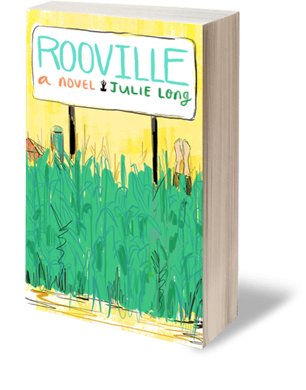
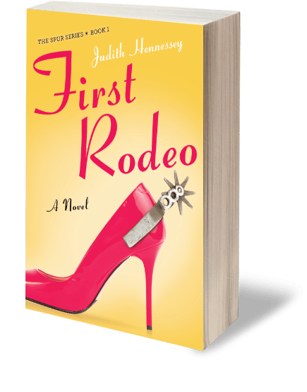
We’ve been publishing books with yellow covers since 2015, starting with Rooville by Julie Long and quickly followed by First Rodeo by Judith Hennessey in 2016.
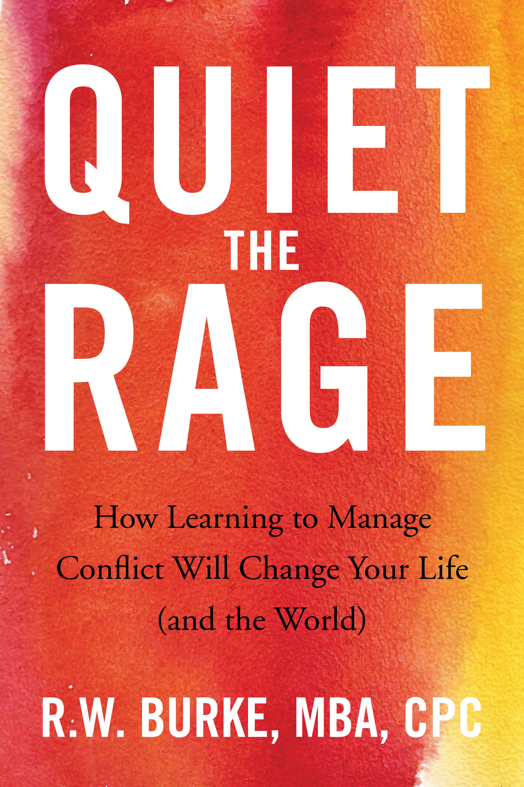
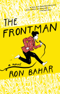
To stand out from the sea of millennial pink covers in 2017 and 2018, we really picked up on our use of yellow and orange with The Frontman by Ron Bahar, Quiet the Rage by R.W. Burke, and Engineering a Life by Krishan K. Bedi.

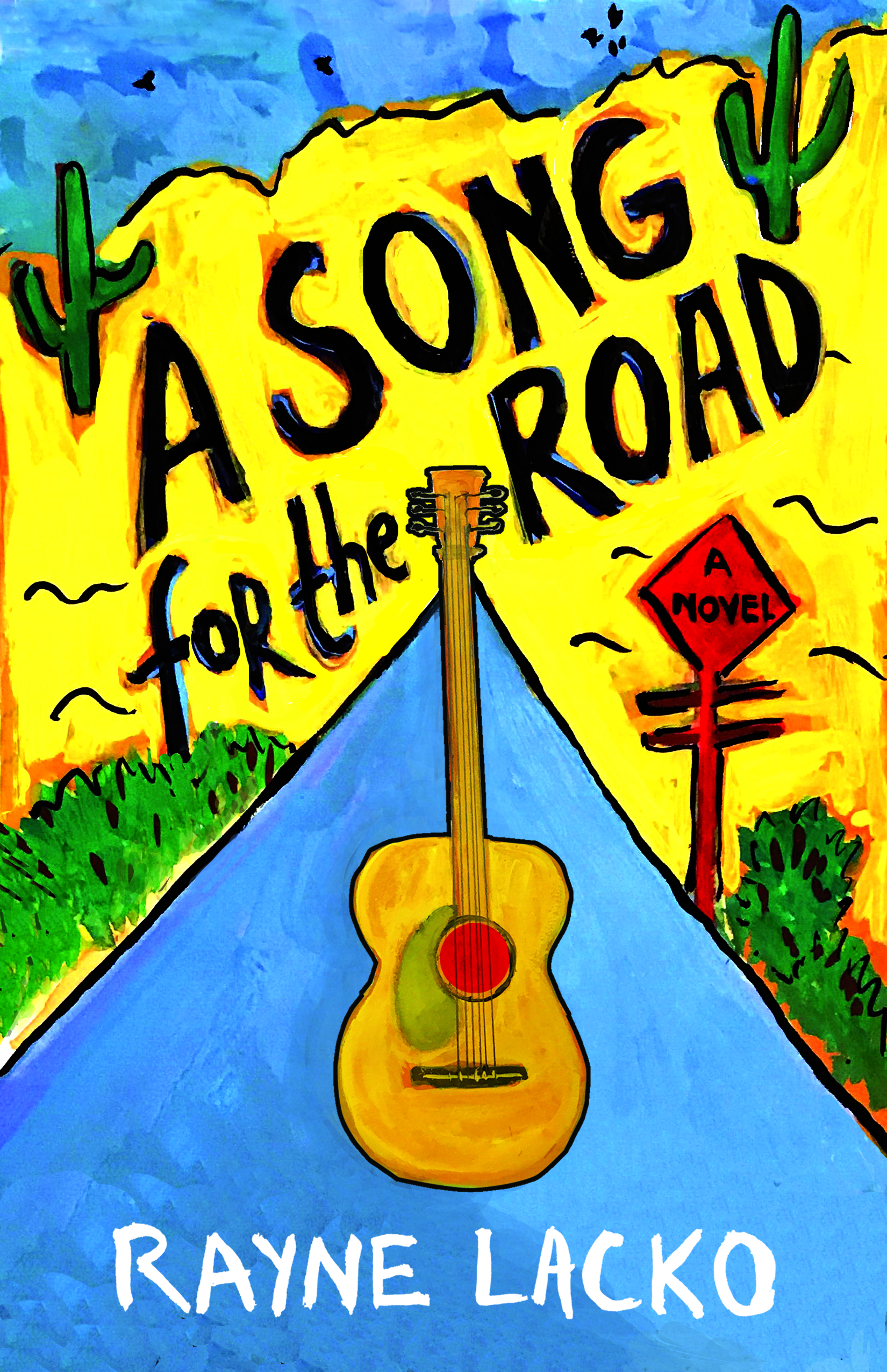
You’ll see this trend continue in 2019 with a pop of yellow on the cover of A Song for the Road by Rayne Lacko.
Florals
While including flowers on a cover is nothing new, nowadays the floral patterns seem to be interacting with the text, giving a fresh twist on an old trend.


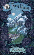
In anticipation of this trend, in 2018 we took it a step further. Instead of just having the florals interact with the text, we had it become the text. On the cover of The Thorn Queen by Elise Holland, the title is literally made of thorn-covered stems.
Design Cover-Up
Florals aren’t the only thing that can interact with text. The design of the book can partially obscure the title, giving it a layered three-dimensional look.
At SparkPress, clarity is key with our titles, so this trend is used sparingly. However, on the cover of Found by Emily Brett, the hand on the cover interacts with the title. If you look closely, you may notice that the thumb is behind the N, while the other fingers are in front, partially obscuring it.


We will be revisiting this trend in 2019 as it rises to popularity. The top of Amy’s head partially obscures the bottom of the K on the cover of Pursuits Unknown by Ellen Clary.
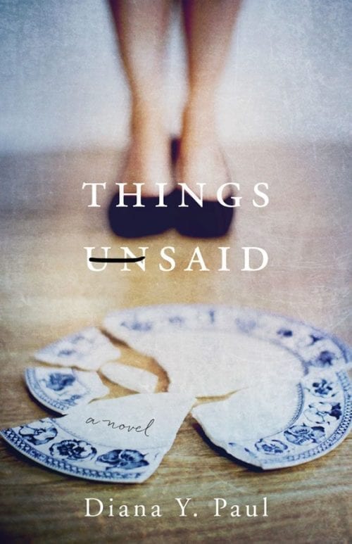
The Cross-Out
This trend is sometimes used as decoration or redaction. Other times, it brings new information to the cover.
Okay, we’re cheating a little with this one. SparkPress doesn’t have any books with a cross-out—but our sister press, She Writes Press, which uses the same team of designers, does.
The cover for Things Unsaid by Diana Y. Paul crosses out the “Un.” Not quite redacting, since the title doesn’t change, it instead tells us that that during the course of the novel, the things that have been unsaid for decades will finally come out.
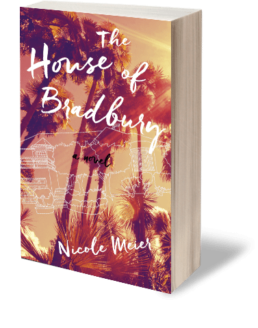
Hyper-realism
These covers create effortlessness nostalgia and make you look twice by introducing the familiar in a new setting. The trend is especially popular with creating ripped-from-the-headlines looks.
In our own twist on the hyper-realism trend, we have The House of Bradbury by Nicole Meier. This cover puts a drawing of a house in a new context, sketched over a photograph of palm trees.
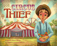
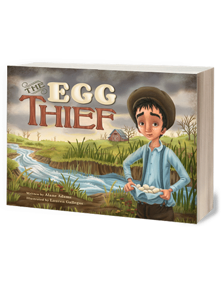
Mid-century Modern illustrations
This style of illustration was widely popular in the mid 20thcentury, and is just now seeing a resurgence. Some have bit of a vintage feel, but all are stunning.
In the vein of vintage-feeling illustrated covers, we have the vivid Thief books by Alane Adams. These picture books tell stories about a young boy names Georgie, growing up in poverty in the 1920s.


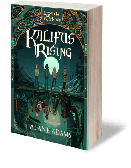
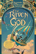
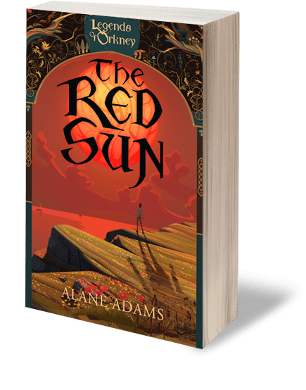
Lydian
Lydian is expected to be the font of the year—even though it’s been around since the thirties. It’s the perfect blend of type and calligraphic design. While we don’t have any books with this exact font, the calligraphic style, with parts of the font being heavier than others, is present on the entire Legends of Orkney series by Alane Adams.
Thank you to Spark Press for the wonderful overview of book cover design, including the design trend called “The Cross-Out” which features my book cover for Things Unsaid. Also check out Peter Mendelsund’s website for a range of some of his amazing book covers as well!