
As cover designers, we often find that our go-to solution involves photography. This use of photography on book covers is on-trend right now, and lucky for us, there are so many excellent photo agencies with a wide range of images suitable for everything from commercial subject matter to the more artistic photography we love to use on our fiction titles.
But sometimes a book deals with a subject where we just cannot find a photograph that will work, or the tone and message of the book require a different kind of feeling—something humorous or more fantastical that is better suited to an illustration. Here are a few cases where we chose an illustration over photography for a book cover.
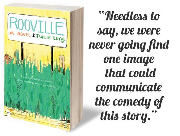
Rooville
Is a “fish out of water” story in which the main character returns home to find that a once-quiet Midwestern farming community has been taken over by a New Age guru. As they say, adventures ensue, including a tornado. Needless to say, we were never going find one image that could communicate the comedy of this story. I reached out to designer and illustrator Sarah Lazarovic whose style has a wonderful wry touch. In addition to her deft skill with figures and objects, she also creates wonderful handlettering, which also came into play for this cover. Her illustration brilliantly incorporated so many themes in the book, like a yogi’s legs spryly sticking out of the corn stalks.
Star Craving Mad
Was ano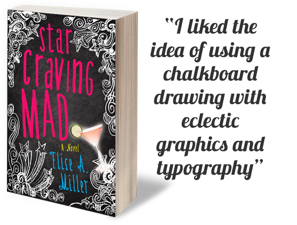 ther novel where there was no one image, or even ten that could show the fun absurdity of the story. A woman encounters celebrities at her child’s school and, as the title suggests, gets wrapped up in their world…too much so. I liked the idea of using a chalkboard drawing, indicative of the school setting, with eclectic graphics and typography to allude to the fantasy portion of the story. I added just a snippet of the real world in the form of a mad cocktail. Cheers!
Hindsight
Our about-to-be published novel Hindsight is a fantasy story about a woman who has the ability to reconnect with her past lives. I worked with our designer Rebecca Lown to produce a cover that was fun, smart, and accessible.
Here, Rebecca shares some of her process: How do you visually convey the idea of a woman who can connect with her past lives?
 I didn’t want to get into the specificity of each person, so using photographs was not the way to go. I liked the idea of using silhouettes of women’s heads, where the different hairstyles would hint at different historical time periods, and by playing with the sizes of each silhouetted head I tried to convey the passage of time. I love how the heads interconnect and overlap through the use of transparent colors.
In the design brief, the author describes the main protagonist as a solitary character, so I chose to keep the cover design simple, without any distracting background, so that we just focus on the woman and her many selves.The book has a comic aspect to it and I tried to evoke that by using a handwritten typeface and bright colors.
Rebecca offered us a number of color combination choices but in the end we were all drawn to the version with a clean white background, which really helps the cover design breathe…appropriate for this subject matter!
On a side note, I’d like to give a shout-out to our authors who have really taken time to respond to our cover memo (a questionnaire of sorts that all our authors complete prior to their cover design) with thoughtful details that really help us designers do our very best work. Cover design has never been more important, especially with changing buying habits of readers. Think of your cover as the single most important piece of visual advertising that will help every part of your promotion and publicity efforts. Then, make it the best it can be!
MORE FROM JULIE METZ
Julie Metz on the 7 Successful Elements of a Book Cover
Last Minute Touches That Made 4 Book Covers Stand Out
and in her third, How a Book Cover Can Showcase an Edgy Theme.
Leave A Comment